EDWARD HOPPER HOUSE MUSEUM & STUDY CENTER IS GRATEFUL TO CARBONE SMOLAN AGENCY FOR CREATING OUR LOGO AND BRAND GUIDELINES.
BRAND PLATFORM
Please refer to us with our full name: Edward Hopper House Museum & Study Center. If a shorter version is necessary, use the nomenclature hierarchy below. (DO NOT use "Hopper House" for any public-facing communications.)
First reference in text: Edward Hopper House Museum & Study Center
Second reference in text: Edward Hopper House Museum
Third reference in text: Edward Hopper House
First reference in text: Edward Hopper House Museum & Study Center
Second reference in text: Edward Hopper House Museum
Third reference in text: Edward Hopper House
PurposeEdward Hopper House gives depth to an artist whose honest representation of life in America perennially evokes both contemplation and reflection.
|
PROMISEEdward Hopper House celebrates and advances the legacy of Edward Hopper through artifacts, programs, and exhibitions inspired by the iconic painter.
|
Values
|
ILLUMINATING
We provide engaging experiences that explore new perspectives on how we perceive the world around us and the people who touch our lives. |
INTIMATE
Warm and welcoming to all, we foster personal connections to the past and contemplation on the present day. |
BOLD
Exciting, adventurous and confident, we boldly present our ideas to audiences from around the world. |
Attributes
|
Relatable
|
Adventurous
|
Inspiring
|
Revealing
|
OUR LOGO
|
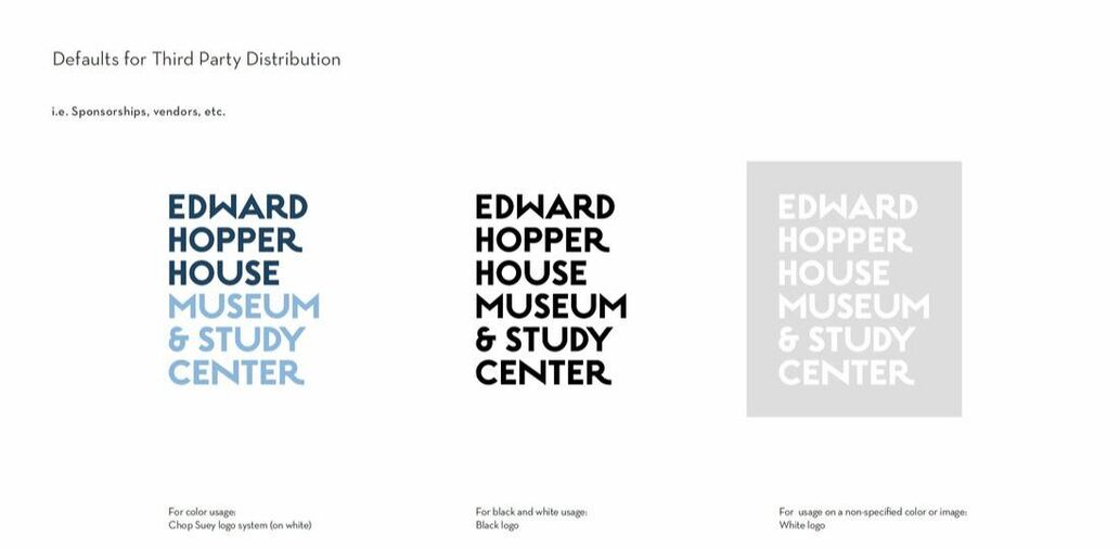
The logo for Edward Hopper House Museum & Study Center was inspired by the time, work, and life of Edward Hopper. The chosen typeface used to create this lockup, ESTILO, brings to life a 1930s art deco style and feel within the logo lockup. Estilo harkens back to the typefaces used on signage and print materials found both in Hopper's paintings, and the world that surrounded him as he painted. The lockup, which includes the aspect "Museum & Study Center," reinforces of Edward Hopper House's mission of sharing and giving a deep understanding of the life of Edward Hopper today and for generations to come.
|
OUR COLORS
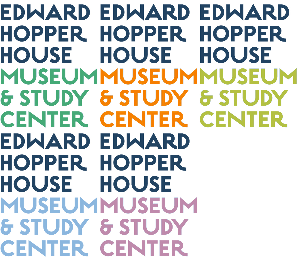
The logo has a robust system of colors that can sit on white and on color to fulfill communication objectives across channels. Similar to the typeface, the color palette was chosen to activate and create a strong connection to Hopper's work. Pulled from five of Hopper's paintings: Nighthawks, Room in Brooklyn, Automat, Chop Suey, and Morning Sun, the warm and engaging colors serve a dual role of both standing out and drawing viewers in.
The entire range of the color palette is displayed here, with codes for applications in CMYK, RGB, web, and Pantone spot color.
If the logo lockup is placed on color, only one of the five triad color options may be used throughout.
If the logo is placed on white, only the specified 2 colors (with white background) may be used.
If the logo is placed on white, only the specified 2 colors (with white background) may be used.
For the triad color logos, the yellow specified MUST be used for the "Edward Hopper House" portion of the lockup. For logos on white backgrounds, the midnight blue specified MUST be used for the "Edward Hopper House" portion of the lockup.
LAYOUT SPACING
|
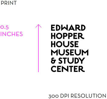
The Edward Hopper House Museum & Study Center logo contains the full brand name, stacked. The relationship between each word has been carefully considered to reproduce clearly across all channels.
Vertical Divider
|
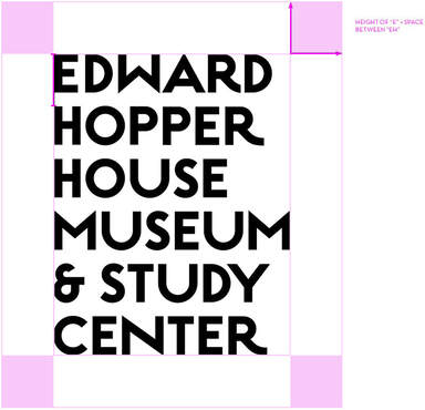
The logo must have clear space around it, and should not be modified in any way. The clear space protects the logo from other visual elements that would harm legibility and/or diminish the significance of the logo. The clear space is defined as the height of the "E" plus the space between "EH".
|
Always use the vertical stacked version of the logo.
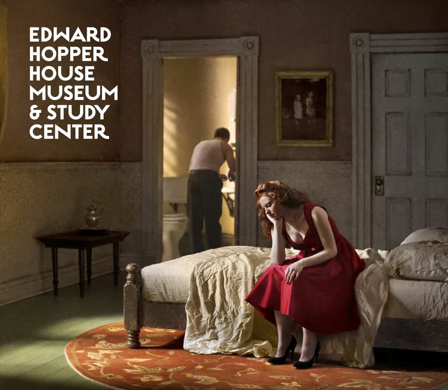
For instances where the logo needs to appear over an image, the logo may be used in an all-white knocked-out version, as shown here. Care should be taken that the recognition of the logo is not impaired by a competitive background. Clear Space rules apply here as well. (This image is a good example of how the clear space is preserved by positioning the logo with respect to the door frame and wainscoting in the image.)
TYPOGRAPHY
Neutra Text is the official typeface which supports the Edward Hopper House Museum & Study Center. With regard to information hierarchy, use Neutra Text BOLD for titles, use Neutra Text DEMI for subheadings, and use Neutra Text BOOK for body copy.
Text should be laid out left justified to complement the logo lockup (which is also left justified).
Text should be laid out left justified to complement the logo lockup (which is also left justified).
EIN 23-7189734
